Deutsche Börse
Risk Monitor Transformation
Research, usability review, workshop facilitation, and UX design for a next-generation intraday risk monitoring experience.
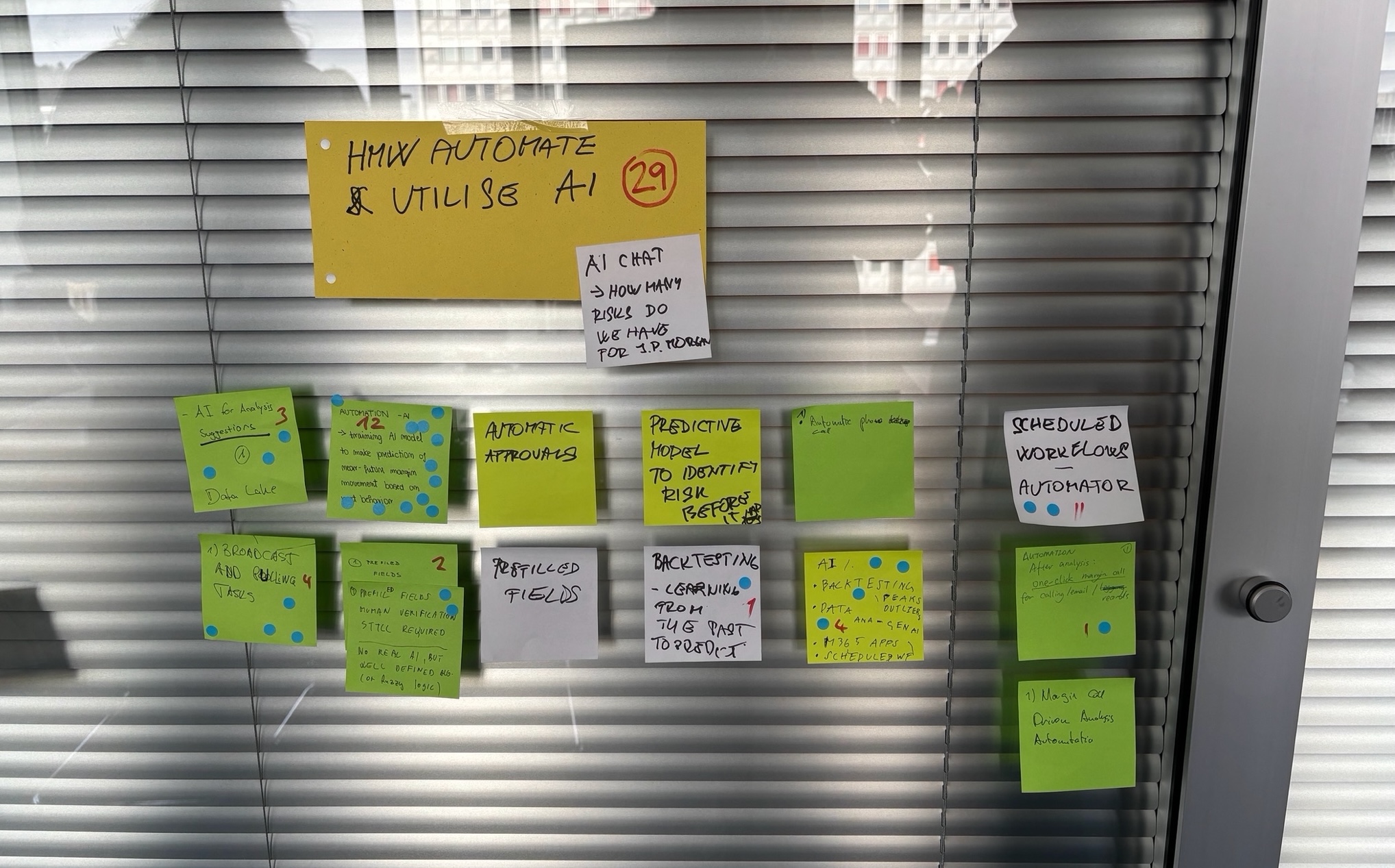
Risk monitoring is a high-pressure environment where clarity matters.
Intraday risk monitoring requires users to understand complex financial exposure, shortfalls, accounts, participants, calls, approvals and mitigation steps under time pressure.
The challenge was to move from an overloaded, Excel-like operational interface toward a more learnable, visual and workflow-driven experience for risk managers.
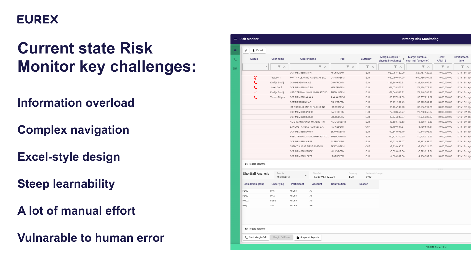
The existing system created cognitive load instead of operational confidence.
The current Risk Monitor experience was difficult to learn and navigate. It exposed users to dense tables, fragmented views, complex workflows and many manual steps.
Research identified several recurring challenges: information overload, complex navigation, Excel-style design, steep learnability, manual effort and vulnerability to human error.
Evidence first: understand the workflow before redesigning the interface.
The work started by examining how users interacted with the existing risk monitor, where they lost time, where they relied on workarounds, and where the interface made the task harder than necessary.
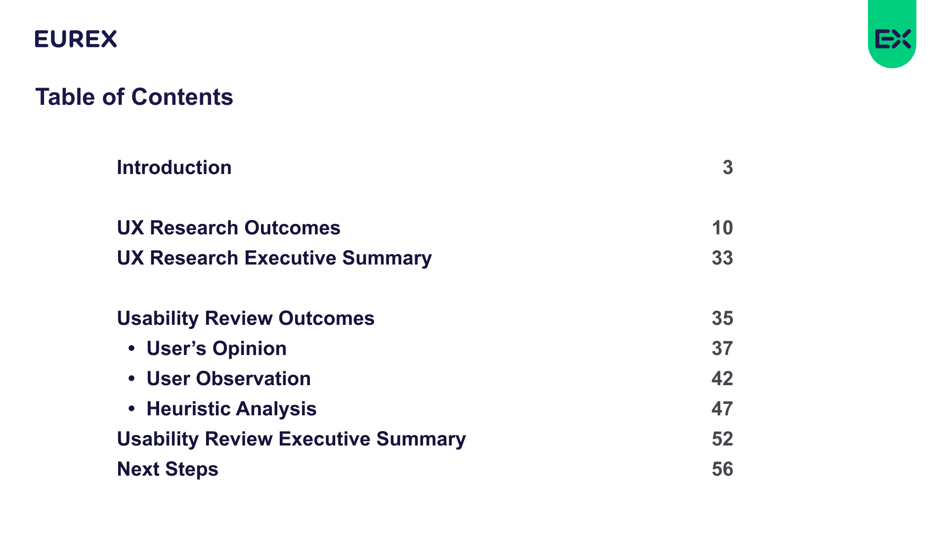
The research combined user feedback, observation, usability review and heuristic analysis. The goal was not only to collect issues, but to translate them into a clear product direction for a better risk-monitoring workflow.
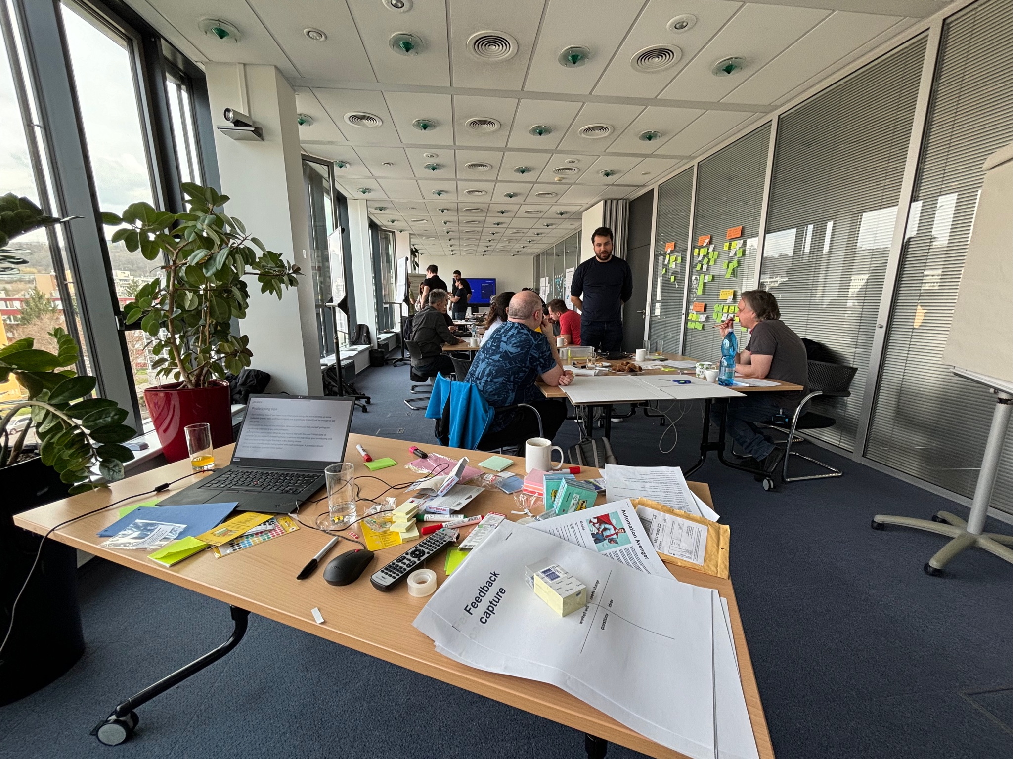
Diagnose current friction
Identify where the existing interface created information overload, navigation friction and manual effort.
Research real workflows
Capture user opinion, observed behaviour, usability issues and heuristic findings.
Co-create alternatives
Use workshops, sketches and prototypes to explore new navigation, prioritization and workflow models.
Design the future state
Translate findings into a more visual, guided and consistent risk-monitoring experience.
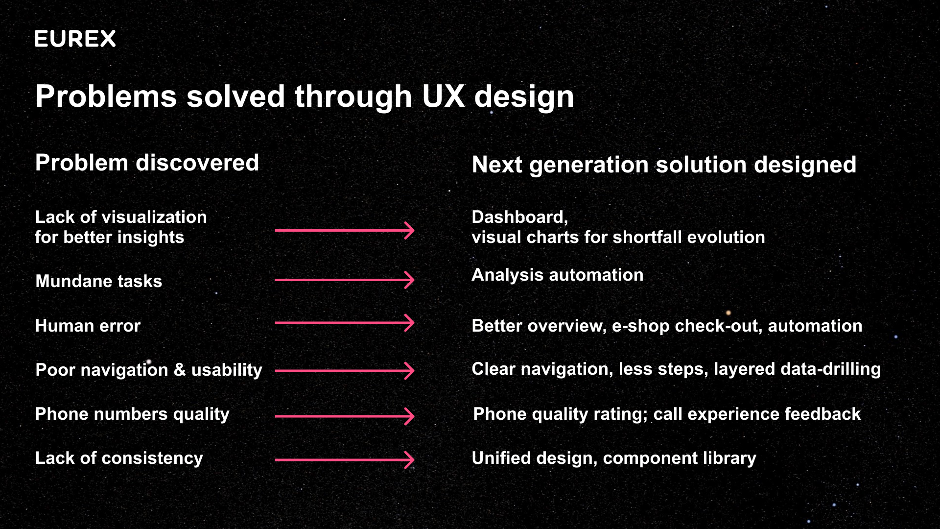
From overloaded monitoring to guided risk mitigation.
The redesign direction shifted the experience away from dense table-first monitoring and toward a clearer workflow: detect shortfall, analyze risk, initiate margin calls, coordinate approvals, manage payment, and track mitigation.
The concept introduced stronger visualization, clearer task progression, better drill-down, automation opportunities, call experience feedback, improved navigation and a more unified component-based interface.
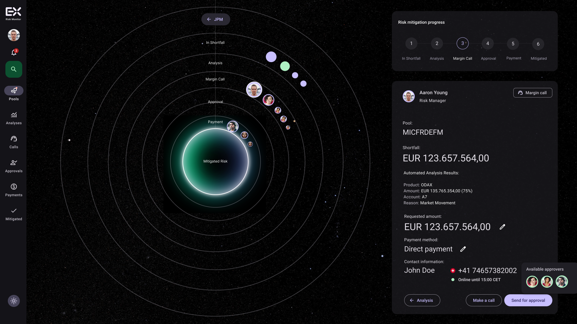
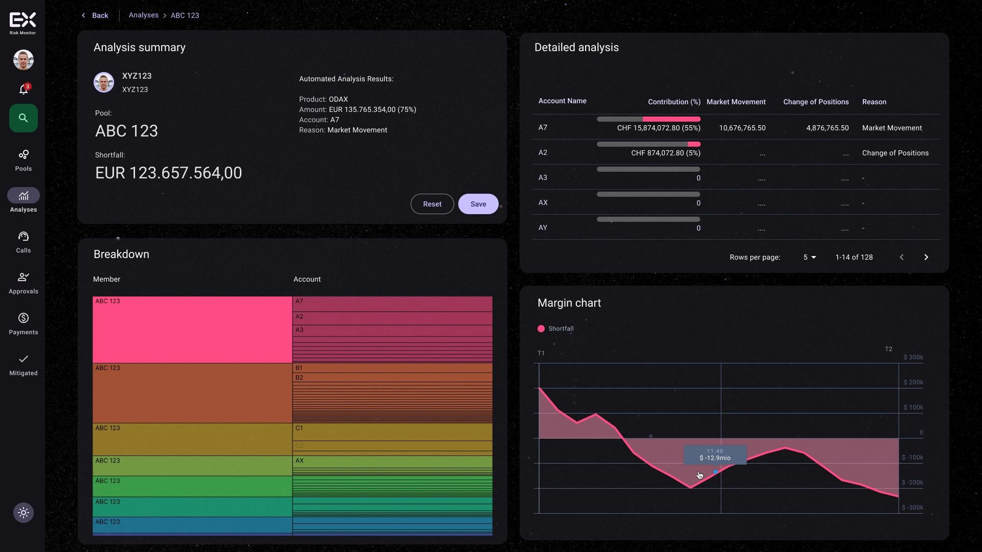
A more visual, learnable and workflow-driven risk monitor.
The next-generation concept used a darker, focused visual language with layered information, clear progress states, drill-down patterns, analysis panels and task-specific actions.
Instead of forcing users to interpret everything through tables, the design explored how risk status, shortfall evolution, account contribution, calls, approvals and payment steps could be represented as a coherent operational journey.
A research-backed vision for the next generation of risk monitoring.
The work helped translate research findings into a tangible product direction: less cognitive load, clearer navigation, more automation, better visualization and a stronger foundation for consistent enterprise UX.